Sunday, December 16, 2007

Fashion Royalty Challenge

This challenges #7 was to create a centerpiece garment in a new collection for the FR line, with the Designers point of view – not Jason’s (who is the dolls creator) but ours! The collection is call “Joie de Vivre” or the Joy of Life. With the centerpiece set titled :”Clair de Lune” or Moonlight. The contest is getting slim now only 6 designers this time. Andrea had a well deserved win with this beautify executed and well designed dress. She also won the popular vote. YEA!!! My pick as well. You will love her blog she is so creative and shares her process of creating. She also has a cute video .

I am no longer going to review the garment entries. With only a few remaining contestants it is just not fair any more to judge them. They are all wonderful. I will post only my top pics of the challenge, which were Andrea, and Brenda. And for the readership who are not connected with PDW I will post the contestant who was eliminated.
This week we have to say good bye to Debbie. An amazing and wonderful designer, whom I figured would finish in the top three. Good-bye friend and congratulations on coming this far!
Here are the remaining contestants in no particular order along with their blog, which I recommend for excellent information on their creations.

http://leighslaughter.blogspot.com/

http://judithmarkich.blogspot.com/

http://900dreamstreet.blogspot.com/

http://900dreamstreet.50megs.com/photo6.html


Tuesday, December 11, 2007

"I am ready for my close up now......"

“Sunset Boulevard”
Gloria Swanson
as
Norma Desmond

(photo courtesy of TED - thanks)

WOW... I am overwhelmed.. I won a second challenge! And this was a really hard challenge. Thank-you TED and Alexandria.

Truth is this is a design idea I have wanted to revisit for quite a while. I also was not interested in doing the challenge exactly by all the guidelines (doll) this time, because in the end I wanted to have a beautiful doll. I started a cocoon coat a few years back and lost interest in doing it when a new challenge presented itself. So when I told a coworker about this challenge she suggested “Sunset Boulevard” I snapped up that suggestion knowing it would give me another chance to play with that design idea again. When I first attempted (years ago) to do this design my fabric choice was just too heavy + my intention was to douche it in fur which made it sooo bulky. But now I have a chance to rethink and redesign. I tore my doll room apart to find the old project but I must have dumped it ..Luckily TED was gratuitous enough to give us the challenge early to research I was able to design and sew on my day off (Sunday). The biggest part of that day was designing the cocoon coat. Knowing the one I did before was a failure I could take some short cuts I would not have normally. Luckily the first mockup I made looked perfect and my test was out of some odd silk I had so I have a coat to spare, which I gave to Dot. I only had to tweak the hem line to get some additional drama I was looking for.
Early on I knew I was not going to use the Alex doll even though I had one. She is not articulated. I am so spoiled now I will not do a big doll with out actuation. I also knew to get the dramatic stance I wanted to project the character the doll would have to be articulated. I love this period in textile design but to get the really drapey effect on a small doll is not an easy task. So off I go on Monday’s lunch break to find silk georgette. No luck. So back to my fabric stashes...I did find the fabric I had for my original project and hoped I could get it to do my bidding.
I draped the dress mostly on the doll with out a pattern. The skirt is simply 3 half circles with an inset of silk down the front. After attaching the skirt it was not draping happily for me. So my next step was to my happy Rowenta Iron.
With pins and steam I stretched the bias of the skirt and created lots of little pleats. When complete I was thrilled for the skirt contentedly snugged into the body of the doll for the silhouette I was hoping for. One thing I have been thankful for doing PDW is that I have been doing a lot of experiments due to time restraints. Lucky for me experiments like this one has been successful and has added tools to my sewing arsenal.

Another truth about this doll is she is NOT finished. This doll “Screams” for beading and it is my intention to go back and add a lot of beading detail. Jim Farone has ask me to donate an OOAK for the Live Auction benefiting Children with Aids at this summers IFDC. This is the doll that I will be donating.


There were some questions on the group about where I got the cigarette the doll holds. Well I made it and it was so easy any one can do this. I used a round Tooth pick and cut off one pointy end.
I always keep black nail polish in my doll craft cart It comes in very handy for soooo many doll projects you would not believe. I painted the whole tooth pick black and when it dried I simply dipped the end of it in the bottle of white paint to what I thought would be a good size for a cigarette. When that dried I dipped just the end into a puddle of gold paint.
Sooooooo easy...right?

Dollie-ON,

Durelle

Saturday, December 8, 2007

Alex challenge.... aye aye aye,,,,

My #1 pick this week is Brenda... I am so proud to give her “MY#1” position. When the thumbnails came up on my computer screen and all the designs were revealed on one page I was immediately struck by the silhouette and colors of her design without ever looking at who, what, when or where. This is a treasure in the design mix. What I have admired about Brenda from day one of this competition is that, she is 'True to Herself' and her design style. She found the perfect movie and character to suite her style and created a dramatic and beautiful solution. Bravo Brenda...yea!!!

Another in my top 3 was Debbie... again.. She accepted the challenge and solved the puzzle. The sheer poke-a-dots were delightful and I loved the short gloves and pearls. I love the way Debbie has her design styled on her blog. And I agree “Why oh why would Ted not choose to use an articulated doll over the straight arms?” The white collar and full skirt on this dress speak “ICON” to me and very 50” But I saw no need for the ribbon shawl. http://debbie-frenchdressing.blogspot.com/


Always in my top 3 is Judith. This week I am a little worried that the dress has come off as a period piece and not as contemporary as the movie. BUT.... WOW.....the FIT...! the COLOR...! The DETAIL.. The jewelry is perfection. How can you not love it. Again on her blog the garments styling is a much better representative of her design concept than the runway show. Great job Judith!
Thank you designers who have blogs I adore reading your blogs on how you solved the design challenges and how your garment were intended to be styled. http://judithmarkich.blogspot.com/

I very much miss Kimberly . I would have loved to see what she would have done. Kimberly, the quality and style of your work was missed this week.


Once again let me say I mean no harsh feelings and I am offering my opinion only as a means of a constructive critique.I welcome critique myself. If all the feed back these designers get is just “PRETTY DOLL” then how can they grow. After all the theory of “Project Dollway” is to find the best! I respect the pressure these designers were under to complete this REALLY tough challenge! The research alone is staggering in a historical respect. Very hard challenge indeed I am having a hard time putting into words what I am thinking. For I have to admit that I was disappointed with the over all work on this challenge.
The sky was the limit as far as choices, Yet the creativity was lacking. I felt like some of the designers were still stuck on the “Over scale” challenge earlier Laces, trim and accent elements clearly out of scale... For the most part the fit was very poor. I think obviously these designers are much more adept in ready to wear than costuming. For it is clear they were out of their element.

Although a stunning costume and silhouette M &G’s “Hello Dolly” was still a miss for me. The swag overlay in front was bulky and fat - the folds did not hang well. A brilliant Designer friend, Judy once gave me a tip on doing this. She cuts a swag on a bias and hangs it wet... to “FIND” its folds... this is what I am missing here.. The swag on the front is bubbling out and distorting the look of the garment. The Dress is well made and a beautiful color but not period correct.


Andrea... oh my. wonderful idea and almost period correct. The details on the bodice are wonderful and very graphic and your accessories are fantastic, Thanks for showing us your under wear on your blog...hehe I liked the hat better on you blog too On the runway show I did not like it.
But the big mistake was the lace it is way over scale and due to the major color contrast causes it appear even bigger. I could not take my eyes off of it, and not in a good way.
http://andreajaques.blogspot.com/

Leigh’s “Blade Runner”.....OK you get Kudos for being original in your movie selection. But the design is blah.. and leaves me thinking .. is that all... take me somewhere... give me the future... give me color... (black is not so great in a competition like this. it is not eye catching or exciting and you loose the all detail of the design. I am not saying that black is wrong for this movie. But you could have chosen a movie that Rocked.. of ICON dress!


That just leaves Brandon’s “Titanic”.. Nice ideas and the color scheme and fabrics were clever. But in the end the fit was poor.. this is my #1 criteria for good design.. FIT...is crucial. This dress did not fit and the button details were sloppy. The neck line seemed too plain for all of the detail elsewhere. It needed some steaming which was not your fault. As far as period correct... hmmm not completely.


Tuesday, December 4, 2007

Susie in "Germany"

"Edelweiss"

Not much commentary to share here this time. I just jumped on my first idea (which is odd for me) and ran with it. We only had one week to come up with the finial design. I read the challenge out line at work Monday morning. I took out my sketch pad and dashed out my ideas and thoughts. When it came time for lunch I jumped in my car and drove to Johannes to make sure I could get the very important trim needed to make this design happen. Sure enough there is was “EXACTLY” what I wanted even the colors I envisioned. Grabbed it and took off with out any hesitation. Yahooooooo.... When I got home from work I was off and running. Got the outfit started that night.
Next day when I got home my doll buddy Beth, out of the blue had overnight ed to me her Susie...sooo thought full I never even ask I was just going to use a Barbie. (Thank you BETH) And as luck would have it she was a blond, perfect!!! Tuesday night I fitted the outfit to Susie and almost finished it. I took it to work Wednesday morning and bounced some details I had in mind off of some of the other designers. And that night she was finished....... her hair and all!!
I always love to share a few hints that I discover along the design “Trail” and this week I have a very simple solution to a common problem. I use one of my black trouser socks to make the knee high sock for Susie.. The lyrica in the socks was perfect and already washed many times so no need to worry about the black dye getting on the doll. Even cutting it off did not require any hems. So use this tip or not but I think it worked out great with very little effort.
Here she is .....she did not win but she got great feed back on the group and most like her very much.

~ENJOY~

auf Wiedersehen

Saturday, December 1, 2007

#5 The Susie Challenge

The challenge concept:
Take Susie any where in the world and dress her in a contemporary outfit inspired by the local fashion, fabric and traditional dress. She must look contemporary but the local color must be obvious and reasonability authentic.

http://www.projectdollway.com/Susie%20Challenge%20Runway.html

Gee wiz.. this was a fun challenge to see. I am amazed at how wonderful each and every outfit was. The designers really did well on this one. It is going to be hard for he judges to pick a winner. Oh to pick my winner.. Again I am torn as to the clear winner for me..
But top 3 in no order or preference.......ARE


At first glance of the runway show I was in ahwww of Debbie’s London design. It is so tailored and so crisp. Love – love - love the plaid, (great colors) it is tough to get a plaid to work on any small doll but Debbie did it with ease here. The pleating details were awesome and the Eisenhower style jacket was wonderful and a good solution to this small doll. All of the jacket details were scaled perfectly. And ...OH that purse....yummmy..... So cute.. Love it! Loose the hat did not need it. Congratulations ... wonderful results.
http://debbie-frenchdressing.blogspot.com/


Oh Judith’s Greece .. so fresh and fun... you never disappoint us! I can see exactly where your design elements came from. Your research paid off and how you transposed it into street wear for a young girl is perfect. Your design was very detailed and those shoes... did you make them? Adorable. The styling on this doll is so much fun I can see this young traveler out on the streets of Greece with that cute tote taking in the sites. Great job....
http://judithmarkich.blogspot.com/

Another favorite of mine in this challenge was Kimberly’s India. Very simple idea with a lot of very difficult fabrication all done perfectly, one being the pants legs. The detailing is so lovely at the ankle, very striking. I loved the fabric choice here too, a very molded pink. This design was edited perfectly – in this case less is MORE. And with a perfect fit. Thank goodness you kept it simple that is the success of the design. I wish I could see that little hand bag.. Bet it is cute too. I read you were disappointed with the styling of the sari but in my opinion it did not negate the quality of the design. . Well done.. Good luck.
http://boxpleat.blogspot.com/

Karen has really stepped up her game these last 2 rounds I was disappointed that she got the lowest score last round. That was a wonderful design however the judges deemed that it did not follow the out line of the challenge. Sorry Karen. But with that said this round was great and did follow the out line of the challenge. Scotland... ..ah yes, here we go - plaid... yea-good scale for the element you used it on. Plaid is hard; I know caz I am on my own search for a plaid to use on a contest doll I am planning. I would have liked to have seen a crisper pleat on the skirt but the styling did created a youthful and fun feeling. The hat did not do much for the overall design and I felt it was unnecessary. I wish I could see that sporen/purse in detail it was just so clever and appropriate. Good luck and I hope we do not see you go this week. You have done a wonderful job.
http://wwwkolkmankreations.blogspot.com/

Brenda’s Japan..... I am always a sucker for anything Asian. I did like this dress The colors, although not really what I think of as Japan, were bright and happy and claimed an intensity to the design My best description of this outfit would probably be “Quirky” The Asian elements lend themselves well to defining this garment’s country. As far as street wear I do not think the sleeves would work but I personally like them they are fun and I adore how the juxtaposition of colors in the lining and face are done. The stylized Obie is adorable. Why a pink purse?
http://900dreamstreet.blogspot.com/


Andrea’s London ...another winning design. I have to say I appreciated her design much more after reading her blog and seeing her entertaining video.
From the runway show I did not know how many layers she had created. I also did not know that the Jacket was short and she had an attached waist band in red on the skirt. With the jacket open and relaxed this design was a lot more youthful and street worthy. I hope the judges got to see her original vision as she planed it, because I felt the runway made the jacket appear too bulky and stodgy. It gave Susie the appearance of a bell hop. Again, as with all the designs a hat is just wrong for this doll. I know from Andrea’s blog what she was thinking but it read as a pillbox hat on the runway. I love her blog I adore seeing her research process and I have thanked her for slicing open her brain so we can see in.Good job Andrea!
http://www.andreajaques.blogspot.com/

Leigh’s Native American... Dot and I both ooooooed and ahhhhed at this one when it came up. I bet you knitted that sweater... clever you. The colors were so bright and clear. The simple detail on the shirt was very representative of the concept. This was a very youthful and street worthy design, which grasped the challenge extremely well. Boots were cute too.. I now know how heard it is to find shoes for this girl. Nice design and a good casual feeling. Not my favorite but very well done.
http://leighslaughter.blogspot.com/


Brandon’s Paris.... I am surprised more designers did not do this city. Great job... it is such a sweet design but I don’t think the colors say “Paris” to me. I miss the color PINK... to me Paris is Pink (I know that is just me a little coo-koo but ..)
The little jacket is lovely and I like it styled open. The legging and flats are oh-so Parisian.. and the little skirt is cute and short. All very street worthy and wearable I can see any young girl in Paris wearing this... just need an accent color that says Paris... ...
http://www.wickedstitcherypd.blogspot.com/


That just leaves Mario and Gianni’s Spain. This is the only disappointing design in the runway show today. It is the only one that I had to question ...”Now where am I, what county am I in?” I love these guys and they are always spot on. But this was a miss for me... OK..I know you guys are throwing your mouse controllers at me now, but I feel like if I am going to do an honest unbiased review I have to say it. I just did not get it. Maybe it is a Euro thing but it was over designed and bulky. And way too much detail too much trim for this doll. The little lace in the hair.. hmmmm? You guys usually blow me away you are great doll designers but this one .. a miss.
http://magia2000.blogspot.com/

With that said Mario and Gianni are still in my “OVER ALL” top 4 picks to win this competition along with Judith, Debbie and Kimberly.

This “Project Dollway” has been such fun to see and participating in the “At Home” challenges has enhanced it even more for me. Once again thank you TED for the dolly fun.

Tuesday, November 27, 2007

The Tyler Challenge

"Day and Night"


The idea of an over scale print seems easy enough until you go out shopping for it. Nothing in my fabric stash is over scale because I work hard at keeping my dolls in prints representative of their size. So off I went on a hunting trip to “Hancocks” for inspiration but alas a disappointing adventure. At one point I did have in my hands a wonderful large scale cotton Plaid, wonderful colors... but my thoughts were, “Wow everyone will use plaid”.... ~NOT~.... No one in this challenge used plaid. That really surprised me. I should have bought it because I returned home with nothing.

(consept drawing)

I had to rethink, I pondered on doing an Asian theme and adding an over scale dragon appliqué that encircled the dress. (opps done that already) But in the end I came up with another idea...”Day and Night”...... the “Sun and the Moon”. Yes this in my mind is a brilliant idea. One side of the dress day the other night
High contrast fabrics in graphic colors were going to be needed to make this work, but I did not want black and white so yellow and blue were a perfect choice. When I returned to fabric shop I stumbled on to the idea of stripes, which in theory, I could collage together and make sun rays radiating out from my sun face. I found a wonderful yellow and yellow orange stripe. I wanted a blue that was vibrant and a live that did not fall into the gray/blue area. To add texture to that blue I found a modeled print that had a leaf design over lay, thinking that might appear as “stars”.

From the beginning I knew it was doubtful that I would find a sun and moon fabric so I did a search on Google images assuming if I found something I liked I could print on fabric to make an appliqué. I did find a lot of inspiration and even selected an image. But my printer did not cooperate and the print did not come out vibrant enough for me ....soooo what next....? Well I know myself and I figured to get exactly what I wanted I would just have to paint the design on white fabric and then appliqué that onto the dress.

I played around with the radiating strip effect and trashed it, feeling it would create a very bulky effect. But I did make the choice to junction my 2 fabrics on the skirt using a wave line. I added the appliqué but before the skirt was attached to the bodice I did a lot of freeform stitching on the fabric. I did radiating yellow an orange stitching out from the sun and all around the moon I stitched swirling curls in white thread. I LOVE this!!! So much fun...
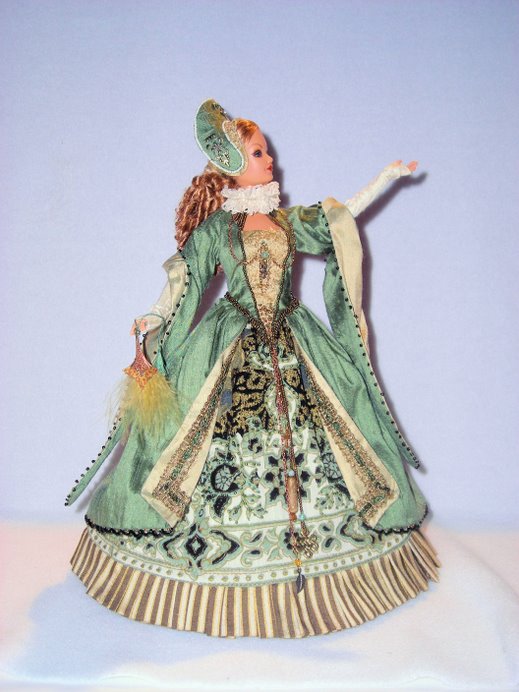
My original drawings were extreme fantasy and “OUT” there with lots of projecting attachments. My tendency to create fantasy is strong and I had to REALLY edit myself to stay as real as possible, knowing all along that real women would never wear this anyway.


In the area of an oversized element my first thoughts were to do a necklace with very large bobbles (moon stones were my choice; again they have a little star effect when light shines on them.) I did assemble the bobbles into a 4 row necklace but the effect was wayyyyyyyyyyyyyyyyyy...over the top. Then I made a really small necklace of delica beads and wrapped it around and round the neck ... in the end I dropped the whole necklace idea all together. I found some blue and yellow stars and arranged them in the dolls hair. I think I may have dropped the ball on this one but it looked good to me. And I am going with it. I finished out the ensemble with 2 more of the stars and made an evening bag to compliment the outfit. Lucky for me some where along the line I had a pair of bright yellow shoes.. yea!


Saturday, November 24, 2007

PDW Tyler Challenge....ahhhhhh yes....

Let me first state that, as an artist playing along in the “At Home” challenge I can empathies with these designers 100%. The premise of this challenge was to create a full skirt ball gown with an oversize print or design on the fabric and with the addition of one oversize element. The “TWIST” was to use cotton.....ugh...cotton.... well anyone who sews for fashion dolls more than likely feel as I do ... and I hate cotton.

While I worked on my own design I realized that this challenge lends it self easily to a Fantasy look. So I was not surprised this morning to find that a lot of the designer’s fashions did have a very fanciful feeling. So when I make that statement it is not meant in a bad way it is just the nature of the challenge.


My top 3 picks this challenge were Brenda, Kimberly and Magia 2000.... to me these 3 designers embraced the essence of the challenge..

Kimberly had the most unique and amazing design I think so far in project! WOW... I was instantly blown away with the whole concept. The pattern of the fabric was soft and subtle but defiantly over scale. The gowns design was wonderful a long bubble skirt and executed perfectly! But it was that bow that really caught my attention, the perfect detail placement was perfect and the color was just right. Every view of this design is lovely.


Brenda, this was her best yet while she usually makes my heart stop with those wonderful accessories this time she was DEAD on with her fashion too. The over scale geometric stripe was dazzling and how she cut and placed the pattern on the skirt made it dance. It seemed to have a movement on its own. The velvet top was exactly right on too and I love that neck line. Oh so clever is the Over size element of the wrap. I adore the Asian “Twist” paper chain idea. Cute cute cute......


Always a winner is Magia 2000 these guys have their hand on the heart beat of what collectors like. This fashion is perfect in every way while most of the designer in the challenge had a somewhat fantasy feeling about their design Mario and Gianni’s design is still realistic looking. The skirt falls perfectly, you would NEVER guess this was cotton. Just lovely.... and I LOVE love love that black bow on the back... with out skipping a beat that bow totally fits into this design with out looking like an after thought .


My vote is still out on this one but one of these 3. mostly because they executed perfect designs with in the parameters of the challenge. Hard choice here for me.

~~~


Now my bottom 3... ugh... sorry guys.. there were some clear misses for me. Even thought I believe even in my own “AT Home” design mine and a lot of these designer faced the issue of their design looking like fantasy... and nothing is wrong with that.. real women are not likely to wear this stuff any way. But a few designers did not “PLAY” well in the over scale concept!


These 3 designers were Andrea, Brandon and Leigh. Let me say here that I am in no way bashing any of these designers I have the up most respect of them as designer and for the accomplishment they have made in this project. I hope that my critique is beneficial and is taken it with the spirit of constructiveness.

Andrea is usually one of my favorites but I feel like the pattern she choose was way tooo busy... far to fussy .. (In my field, interior design I like for my rooms to have a flow and movement yet have a place for the “Eye to Rest”) The same is true of anything in the design arena.. The eye must have a place to rest if the design is too busy then you can not appreciate the fashion. In Andréa’s case she had some wonderful ideas.. The cut out flowers on the bodice sleeves were fab and the way she centered the floral pattern on the bodice starts out great. ...but BAM... once my eye goes to the skirt I am overwhelmed with pattern. To me the pattern choice here is just tooo overwhelming..some good ideas in the design Editing would have helped but very “fairy princess in the woods” theme to me.

Another miss for me is Brandon. The color on this gown is nice but the execution is rough .While I adored Magia’s bow on the back this one was just not there. Even working in OVER scale the size still should have a good relation to the gown and yours was too big. The black ruffle on the bodice was unnecessary.. Again editing...I think this whole finial look of this gown would have come off 100xs better without this element. The ruffle totally competes with the pattern in the gown.


Lastly Leigh,.... totally off base. Seemed to me he simply made a white gown and stuck on an appliqué which had NO relation to the gown at all. The train is silly to me, I am thinking it is the Over size element and not expected but not good. I can not see much of the jewelry but looks like he picked up the colors of the appliqué. I think if this necklace had been his over size element it could have saved the day. By using a really colorful and over size necklace this would have tied the white gown and appliqué together in a much more appealing way. All of the design interest was on the floor... if the color and scale had been brought up in jewelry it could have made he gown more interesting.

The other designers who fell I the middle for me were all wonderful but for a number of reasons I felt were not as brilliant as my top 3.


I am afraid we will have to say good-bye to Jose’ nice design but clearly not the winner.. Again too much pattern for the design of the gown... For a large scale print to work well the gown design needs to be simple.. and there was just too much pattern on this dress. to effectively make the design (which was great) work ... it looked choppy


One of my favorite designers is Judith. I am one of her biggest fans. She did not disappoint me! Sooo adorable... again fantasy like. You had me at hello (to borrow the words of Michael Kors on PW). That bodice is fabulous and fits to perfection . Love the neck line and the butterfly appliqué is flawless. The way the bodice joins the dress is so cute. The large poke-a-dots were a delightful choice as well as the color scheme BRW... you never can go wrong using those colors for a really graphic effect. The accessories looked very appropriate for the fantasy feeling of the design as well. My only negative comment is that white appliqué... what is it? That stumbled my mind ... sorry. Over all really well done always perfect fit and execution... I really admire that... to me fit and execution are maybe the most important and Judith always does an impeccable job.

Debbie is also one of my favorite designers in this competition. She had an adorable gown this challenge, which also fell right into that fantasy feeling. I loved the bold horizontal stripes at the hem... and the bodice was nice bringing up the reverse concept of white w/ black. A lot of interesting detail, maybe too much.. Again editing could have been good here. The buttons on the skirt seemed unnecessary. And I am sorry to say.. in the concept of a “Ball gown” the cuffs were too much, looked cute with the jacket. But they were distracting with out it. As a matter of fact this was a beautiful gown and did not need that jacket at all.

That just leaves Karen...This was a well executed gown as well. I don’t know what "cotton lawn" is (From her blog) but what ever it is beautiful fabric. The problem I had with this design is only that I feel like it did not follow the challenge out line. To me a ball gown is not something that has caprice pants under it and I feel like print was hedging on OK for the scale of the doll. I think these are things that you may have lost points on the grand scheme of things. All that said ...WOW.. I really did like the overall finished product.... so smart and fresh. This dress will defiantly sell well ... easily. Well made and fit is wonderful it has a broad appeal. The hat was unique and fanciful and I liked that it provided a big punch of color. The belt was a good choice too. Over all well edited and a gorgeous garment

Once again Thank you TED for bringing us this entertaining and fun project... well done!!!


"Bianca"

"Bianca"
First place Contest doll for IFDC 2007